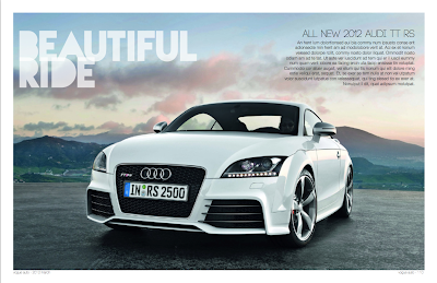

For the past week, I have been working on a magazine spread project.
This is the first time for me to use InDesign and I fall in love with this software already.
Adobe did a very good job on understanding the needs in the magazine/publishing industry and as the same time making InDesign user friendly.
Things I like about my design:
- The left and right symmetry creates stronge composition.
- White space on the second spread creates gaps and made the design less clutter.
- Consistance in color between text and photo
Thing I would like to improve on:
- Paragraphs/sections are not clarity defined.
- Photo in the middle of the second spread runs into the center margin.
No comments:
Post a Comment